Introduction
Overview
VitalityHealth is a United Kingdom-based company specialising in private medical insurance sold to the UK market. The company is a subsidiary of Discovery Limited and alongside VitalityLife and Vitality Corporate Services it forms Discovery Limited's UK insurance offering. Vitality has a vibrant, fresh branding and ever evolving offering in the digital product space.
Their business health care packages are aimed at companies wishing to cover their employees with health insurance and benefits.
THE CHALLENGE
Vitality’s front-line sales staff are known as ‘Advisers’, the team who sit face-to-face with potential clients (typically office managers or company owners of small businesses), collect their details, and calculate a health insurance quote that Vitality can offer their business. These advisers are the end user of this product.
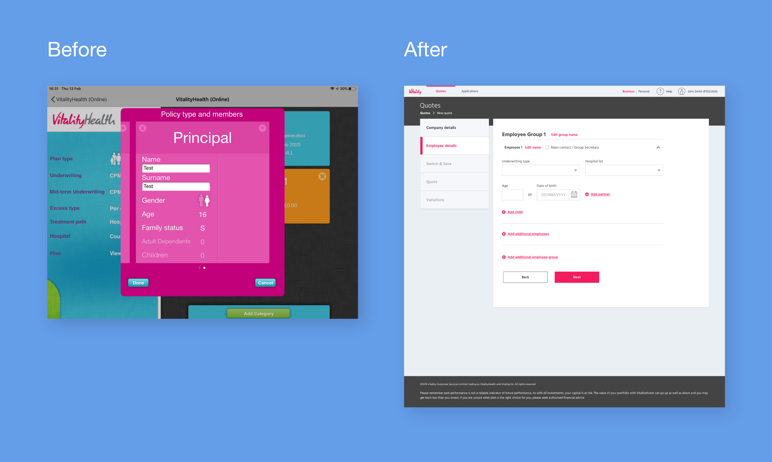
Vitality Advisers were previously using an iPad app which had been in use for over ten years for obtaining quotes. This app was clunky, difficult to use, and visually off-brand. I was assigned to redesign this quote journey in line with the current Vitality design system, with a new user journey and experience.
Role: UX Designer
Scope: 12 week timeline, desktop and tablet-first design (only 5% of users are mobile)
Team: Product Owner, Business Owner, Product Manager, external development agency
Constraints: Limited technical capability from the external developers
Tools: Pen & paper, Figma, InVision, Miro, MS Whiteboard
PROCESS
Research
User flows
Low Fidelity wireframes
Medium fidelity wireframes
Usability testing
‘Rite Testing’ methodology
High fidelity visual designs
Development
Research
Comparative/competitor analysis would have been very useful, to look at companies like BUPA and Aviva, and what digital experience they offer their advisers. Of course this was unfeasible because their products were not available to us.
As an alternative to this, I conducted user interviews. Many of the advisers interviewed had previously worked for competitors and could give insight into their products. (Key take away points from 12 interviews):
High priority
Time efficiency
Create a way of getting back to previous stages to update incorrect informationMedium priority
UI, specifically radio/checkboxes, can be difficult to accurately click when using touch screen. Hybrid laptop/touch devices are frequently used by advisors. As a result I increased the radio buttons in form fields to 48px diameter from 24px.
Low priority
Insurance terminology can differ between users, so it became important to note what users would refer to certain things as. For example, the term ‘Employee group’ was caused confusion when discussed, a number of users who would refer to this as a ‘Category’, which put importance on getting the UX writing correct.
I started by identifying user and business goals, from mind mapping sessions with the Product Owner based on stakeholder and user feedback from the current product.
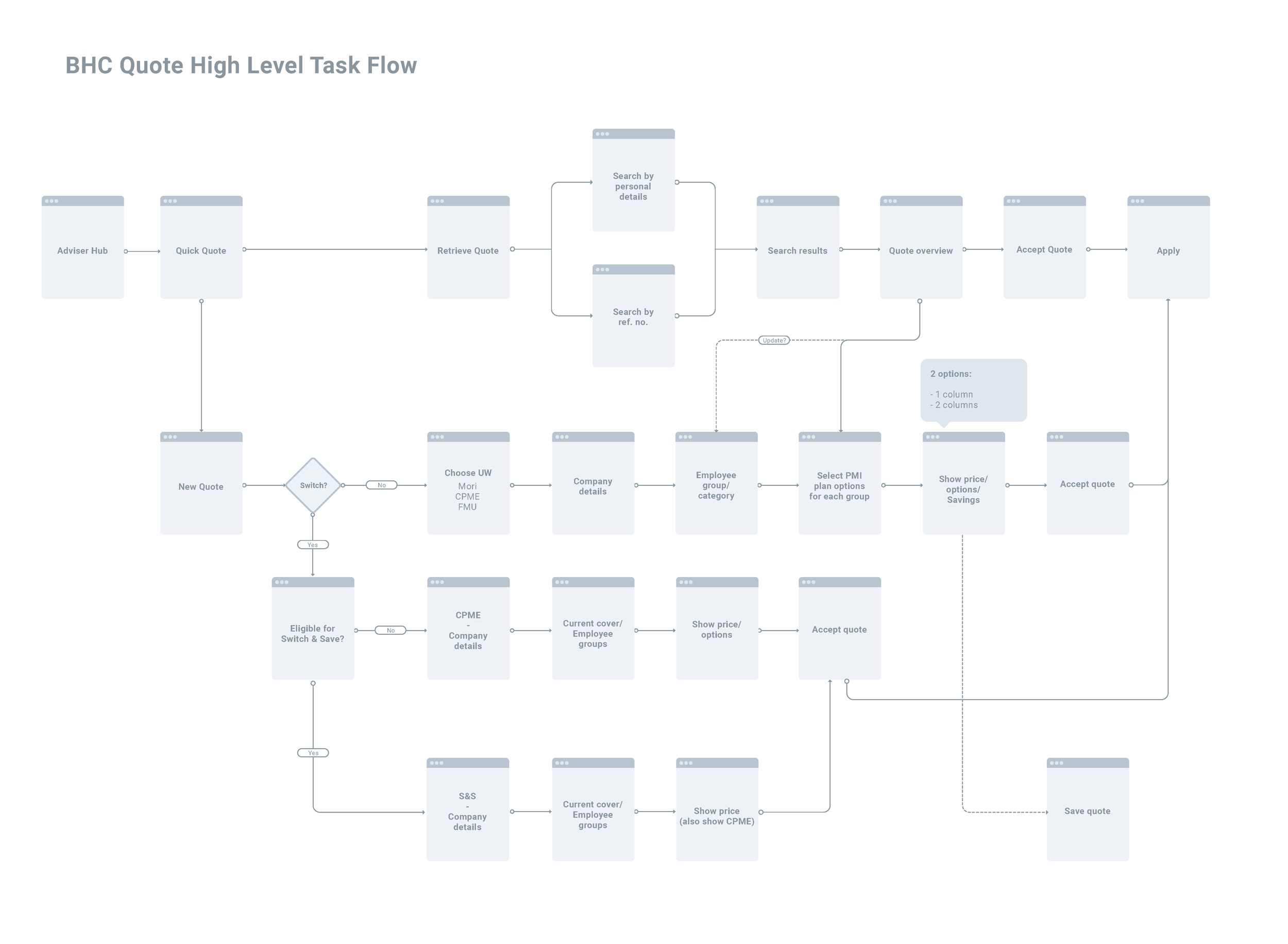
After doing this I created a user flow for the quote journey, detailing every eventuality a user may encounter when creating a quote. Due to the intricate nature of health insurance underwriting, I wanted to take as many complicated data capture sections from the existing journey and condense them to as few steps as possible. For this I collaborated with the Product Owner through Whiteboard, Miro and InVision (and many hours of video calls).
The user flow established how the user would reach their goal of creating a quote to show their client, with all the possibilities the clients data could mean for the journey, e.g. number of employees on the plan, existing health conditions that may limit premium options etc. This resulted in a lot of conditional functionality where the data capture and journey was determined by how questions were answered by the user.
I then proceeded to sketch low-fidelity wireframes, which rooted out further questions and problems to solve in the user flow.
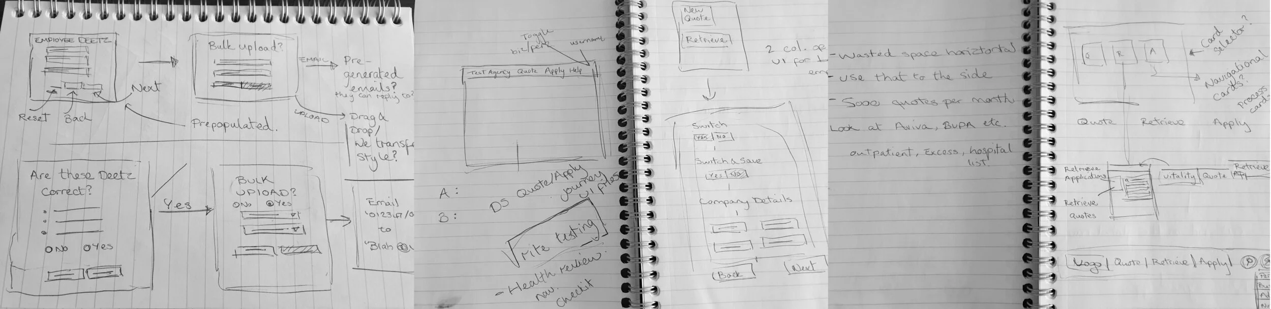
Medium fidelity wireframing came next, which rooted out more issues to solve. I worked with the Business Owner and Product Owner to solve these questions on functionality and more intricate use of UI elements.
Usability testing of the wireframes came next and allowed myself and the Product Owner to analyse pain points and confusion in the journey, as well as gain insight into how the user interacted with the UI to achieve their goals. We used contextual inquiry as much as possible to understand how the user would interact with the product in a sales setting sat next to a potential customer.
From Rapid Iterative Testing and Evaluation we made significant changes to the product and were able to cut unnecessary steps from the product. For example capturing benefits (dental, excess, mental health cover etc) was found to be more useful for the user when combined with the quote stage itself. This meant the user was given a quote price, with selectable benefits that would update the price in real time.
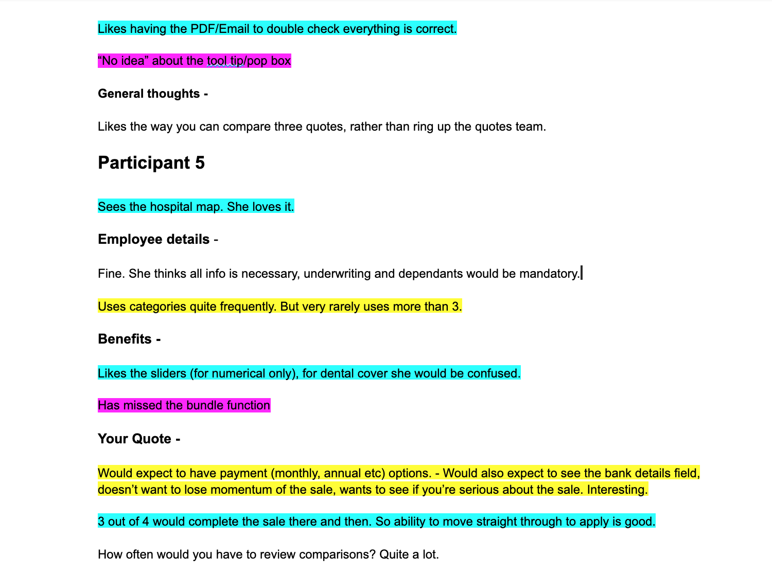
Qualitative analysis of user testing notes to highlight consistent themes
I also established from testing that the users felt it beneficial to enter as much customer detail as possible at each stage. An assumption I had made at this point was that step-by-step, one question at a time process was more focused and clear for the user. Although this was true, in the context of this product, time efficiency and less stages to click through was more important to the user.
Another issue that arose in user testing was the ability to move back stages in the journey to amend information. A breadcrumb had seemed like the most logical option, but in testing it became clear that navigating forward again was challenging using this style. At this stage I proposed a side navigation which served the purpose of visualising the steps of the process for the user, providing stronger orientation. In further testing this was well received.
Design iterations
Medium fidelity wireframes
Visual Design
Outcomes
There were extensive iterations made after wireframe user testing. The main change was the addition of a side navigation bar which also serves as a way of monitoring progress. Users pointed out that they frequently have to go back to previous stages to amend customer information. Additionally, the ‘company details’ steps were condensed into one page. Benefits were also removed from the pre-quote stage of the journey, and assimilated with the ‘quote’ stage of the journey.
From research we understood that time efficiency was key not only to the user but also the business. But this didn’t have to mean using a visually challenging product that only became usable after many years of repeated use. This usability and visual improvement was achieved, with users being able to capture information faster and clearly present Vitality solutions to potential customers with ease.