The problem to be solved
Like anything these days, you like to keep track of what you’ve purchased online. Whether that’s a toothbrush from Amazon, tickets to a gig where there’s an important QR in the email attachment, or a start-of-the-month supermarket shop you need to keep an eye on the delivery of.
Trucks are no different. Customers had no way of seeing where their orders were in the building/delivery process. After confirming their truck purchase, the order “disappeared into a blackhole” (customer interview) until it was ready to be delivered.
The challenge was to deliver a self-service tool that communicates order progress, reduces support calls, and reflects Scania’s premium customer experience. Scania’s wider strategy of omni-channel, giving the user the ability to self serve digitally where possible within the journey, rather than relying on the sales representative.
RESEARCH
Methods Used:
In-depth customer interviews across multiple markets
Contextual inquiry with sales & delivery staff
Analysis of existing order data logs
Competitor analysis (e.g., Tesla, Volvo Trucks, MAN)
Key Insights:
Customers wanted fewer technical terms in communications.
Trust was eroded when order status changed suddenly without explanation.
Dealers wanted to reduce manual follow-ups while maintaining personal contact.
UI clarity and alignment with global brand.
DESIGN PROCESS
Journey Mapping
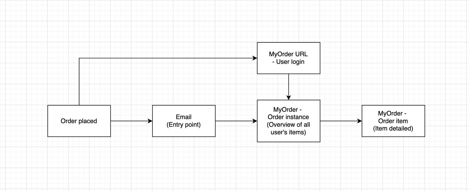
Mapped the order journey from contract signing to delivery. Identified “blind spots” where communication broke down (e.g. production scheduling, shipping delays). As can be seen below, there was a lot of cross function work to be done here, as the system we were proposing would rely heavily on the backend communication/integration with other apps in the sales process.
Ideation
Ideation was drawn largely from the insight I gained in research. When it came to competitor analysis there wasn’t much we could take from other vehicle providers, because these aren’t publicly accessible platforms. But there was a good opportunity to look at other industries and how these experiences could be harnessed, e.g. Amazon and ASOS both showed the useful entry point of email for a platform like the one I was building, an important factor in the user journey.
I explored multiple concepts across timeline visualisations and notification models, these of course would have to be different from the likes of e-commerce platforms due to the spec heavy nature of a truck order.
Wireframing and prototyping
The order instance and order item pages were the core of the product. Order instance to display all the trucks a user has purchased. Order item to display the details of a particular item.
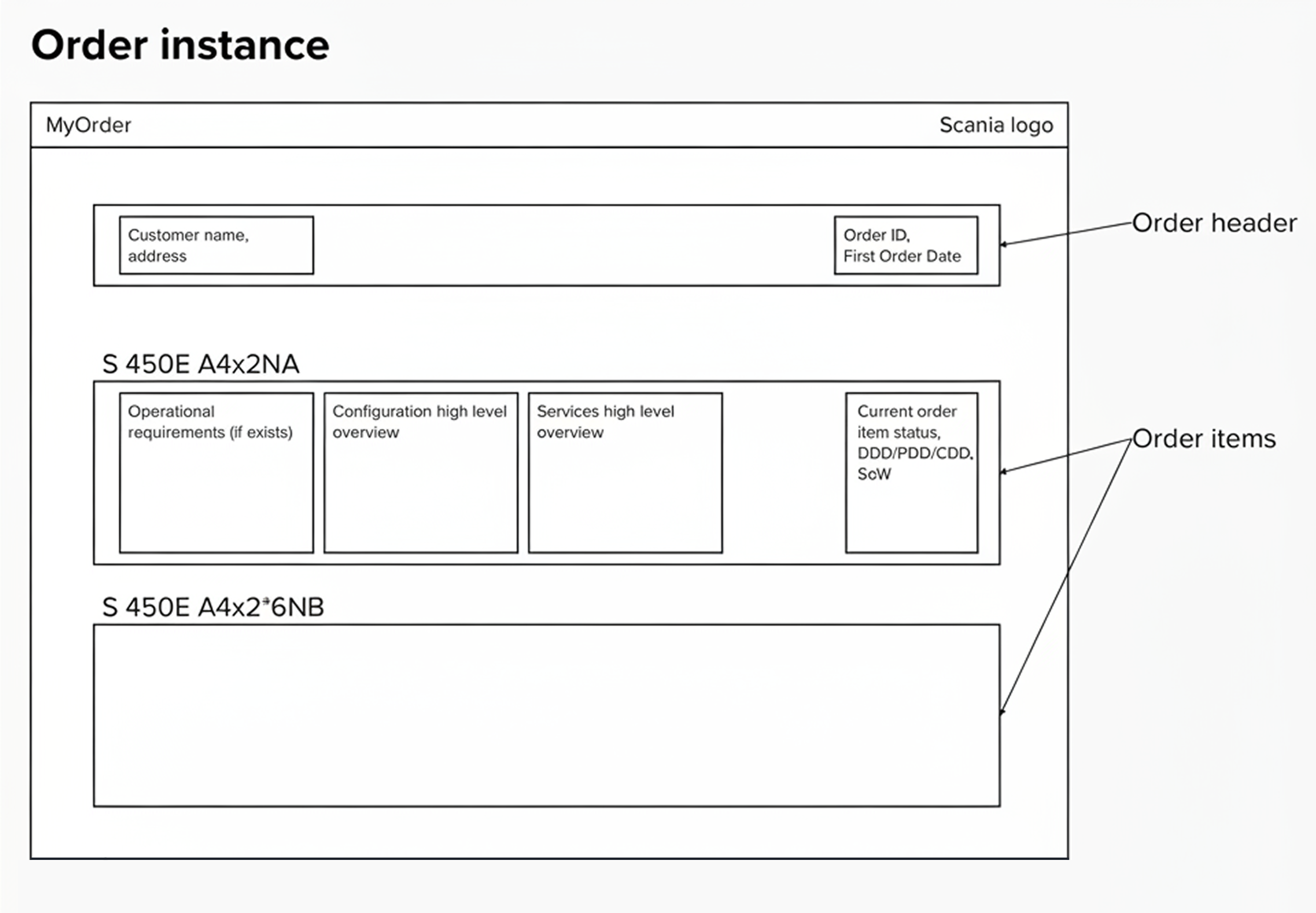
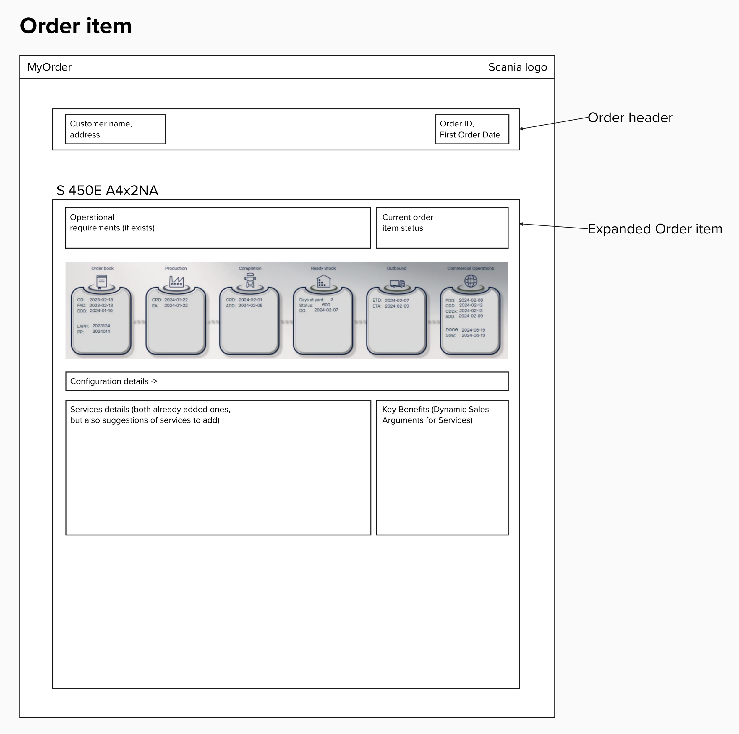
While testing these wireframes with stakeholders and users, it became apparent that not enough emphasis was being put on the order status, and too much focus was on the specification of the vehicle itself, which was more of a secondary goal for the user to access.
UI Design
Contributed to Scania’s Tegel design system with new components for progress tracking.
Designed iconography and colour-coded statuses.
Ensured WCAG accessibility compliance for colour contrast, font sizes, click targets, aria-tags, screenreader compatibility and so on.
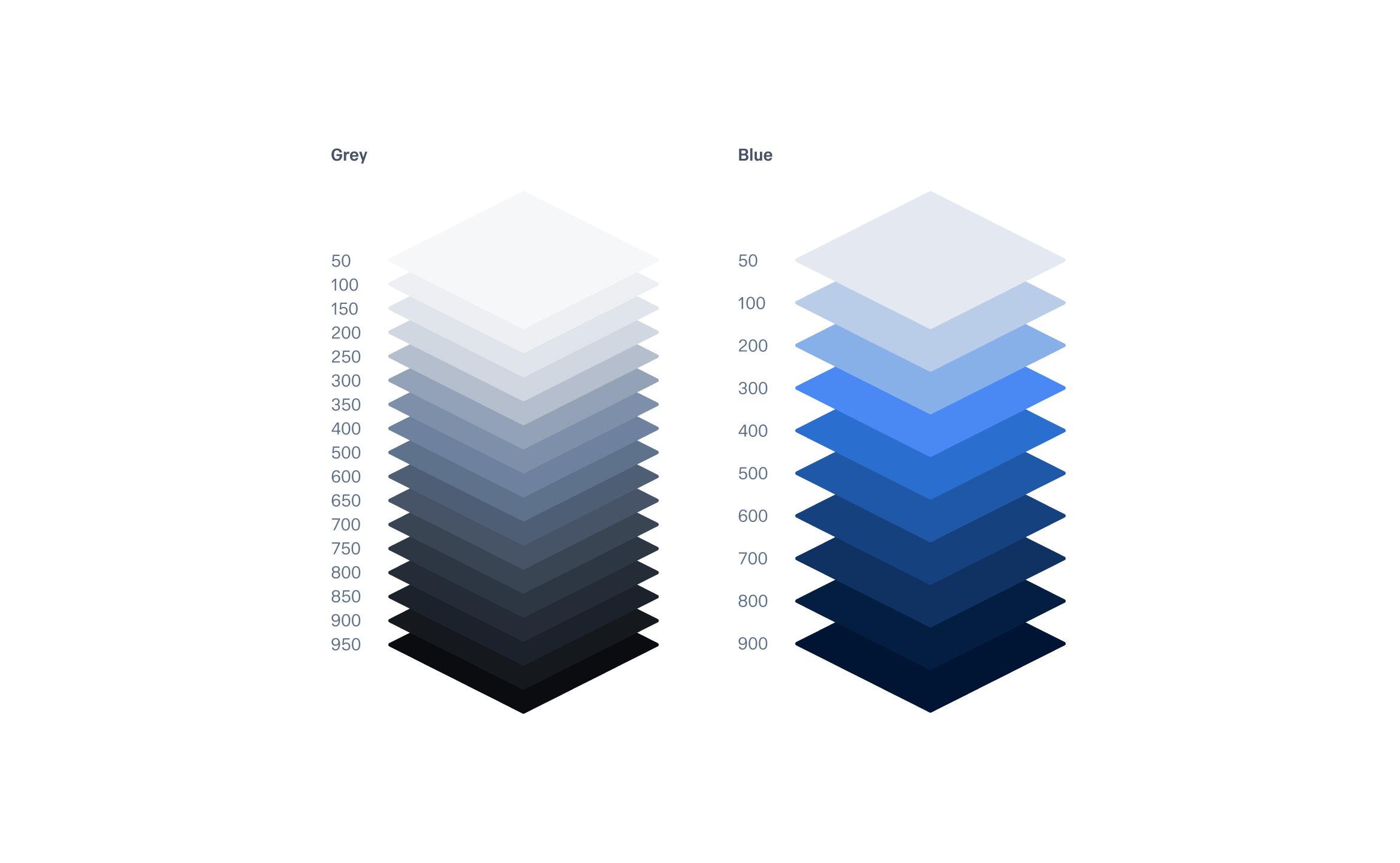
The UI needed to come from Tegel Design System to ensure consistency with existing Scania products and to communicate the identity of the brand. That said, who wants to drop and drag existing components mindlessly into Figma without any thought? Not me. While maintaining complete connection to the design system I set out to build something with a strong and progressive visual impact. Fortunately Tegel has fantastic foundational elements, starting with a wide palette of greys and blues that allowed me to play with gradients.
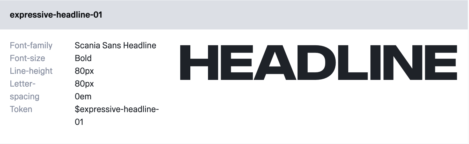
The expressive headline tokens in the design system allow for bold, clean and impactful typography. In the interest of hierarchy I wanted to use this sparingly through the design, so kept this kind of upper case headline only in the hero section, and in the H2 where the order number and dates were displayed.
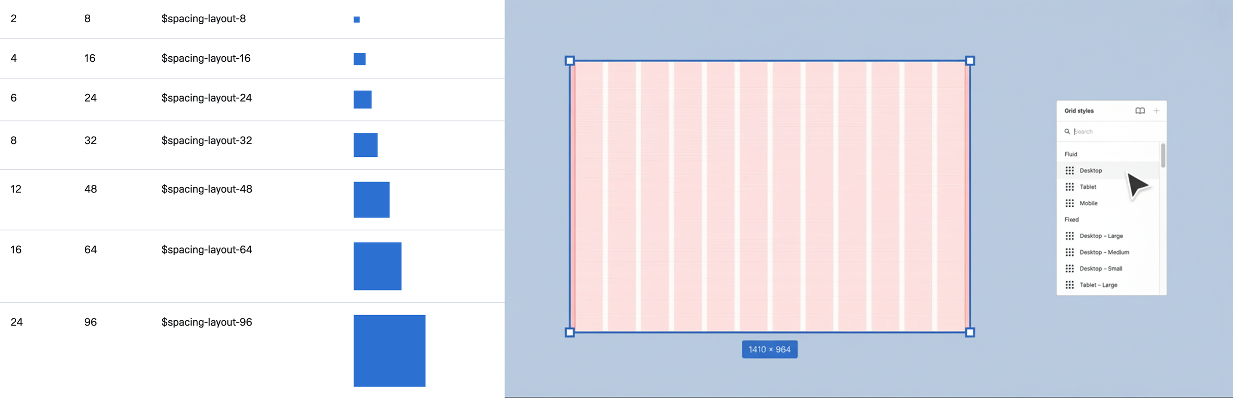
One of my favourite things about applying a design system is the shared use of the same spacing and grid system between design and engineering, this way both myself and my developer can be sure we’re on the same page and building something cohesive, not only across My Order, but in line with all experiences across the Scania brand. And the developer won’t be upset with me because of having to guess what spacing units to use.
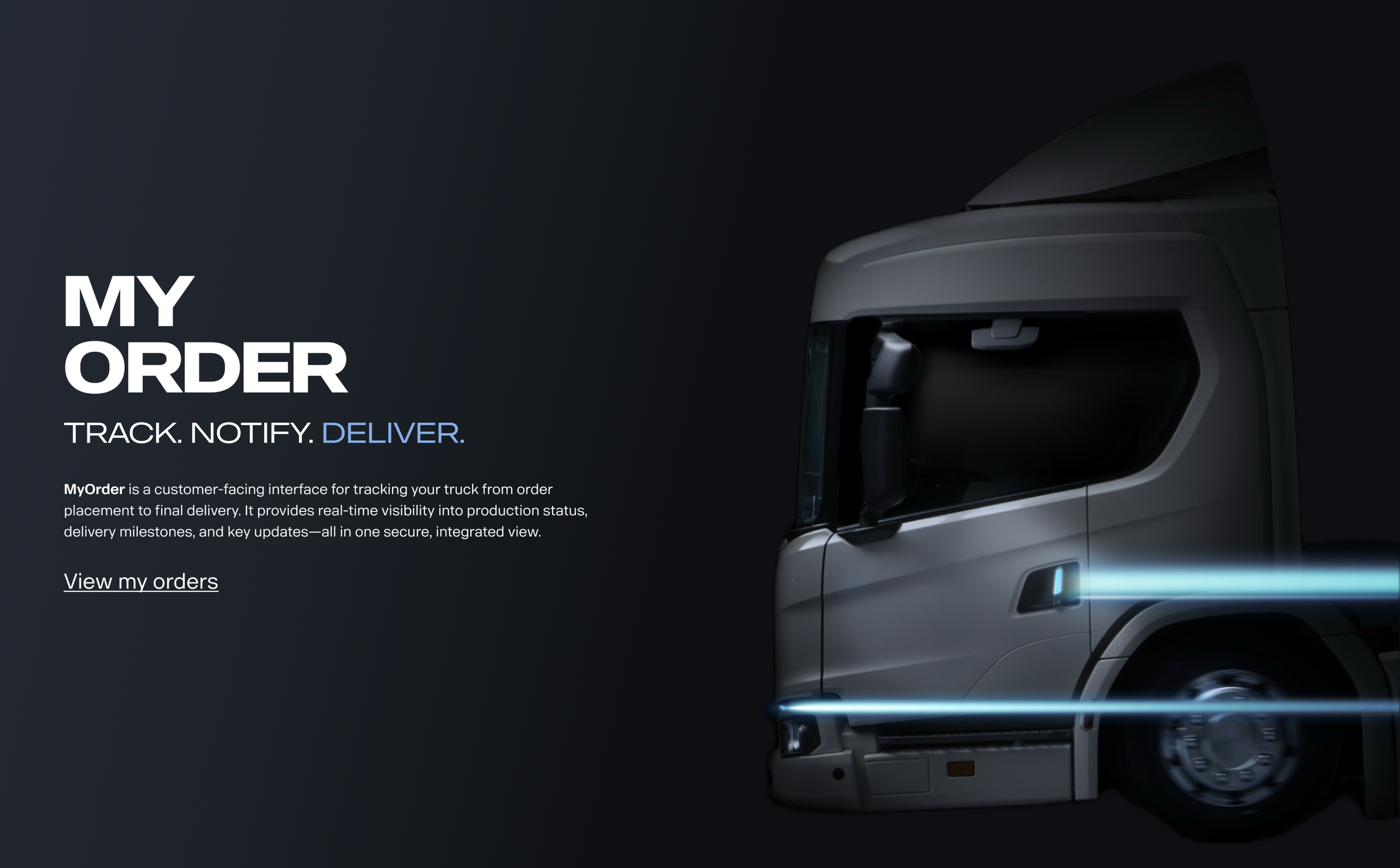
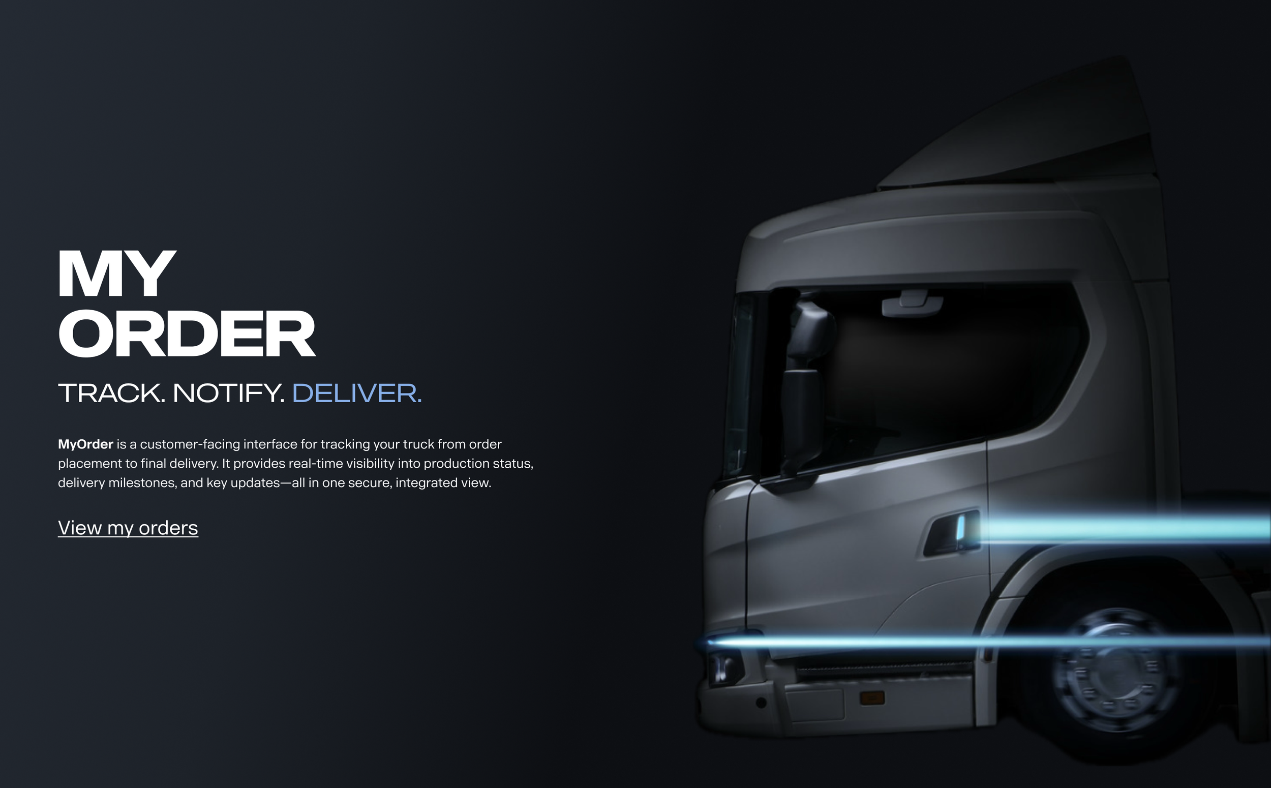
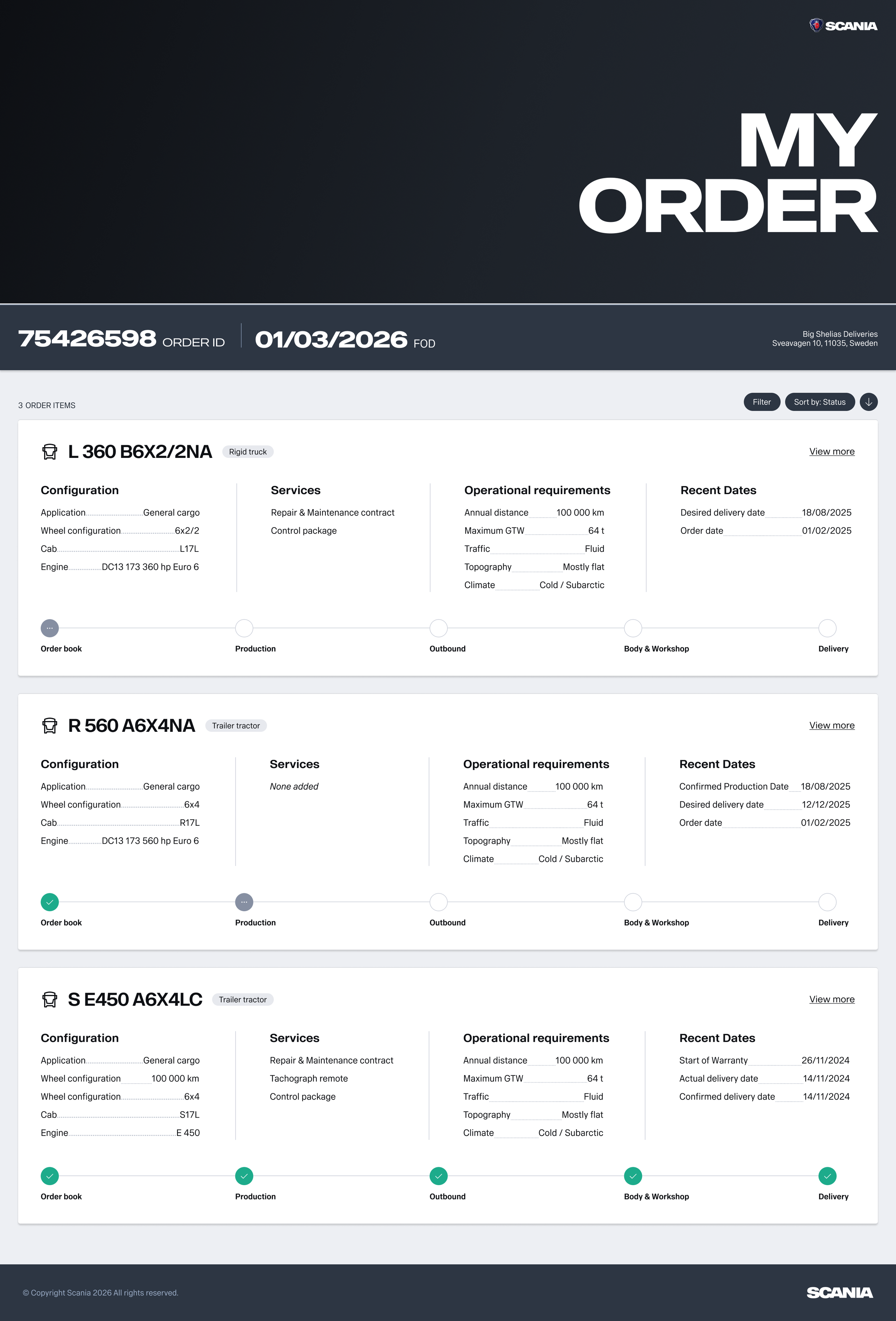
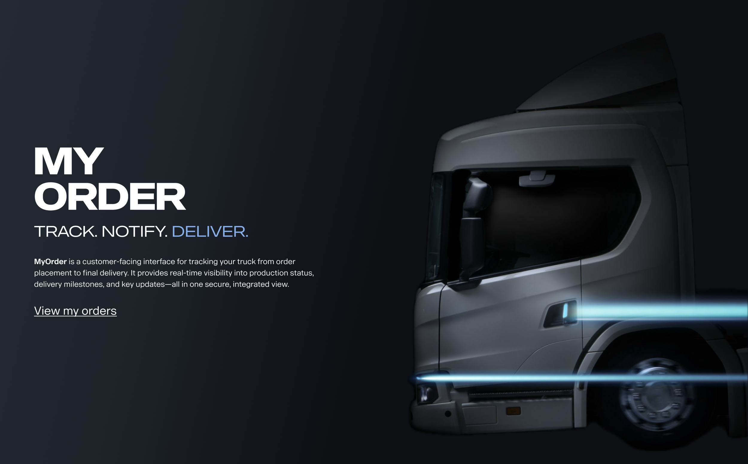
I knew the page would largely be concerned with cards holding important data regarding each order item, so I aimed to anchor the page with some bold contrast in the header, giving the user some orientation when they first land on the page. Below you can see the hero section is minimal and clean - using a deep yet subtle gradient and some clean, bold typography, departing from Scania’s typical header bar with various icons, badges and menu options. The product would be relatively isolated in the ecosystem, so it didn’t require lots of navigational features at the top of the page. I took this as an opportunity to present a clean visual aesthetic.
The below scenario displays 3 vehicles that the user is awaiting. I opted to divide each vehicle (or item) into its own card for hierarchical purposes, and within each card I aimed to display as much relevant information about the vehicle’s specification while anchoring a progress bar component at the bottom of the card, as this was shown to be a key feature that the user wanted to see.
My Order - Landing
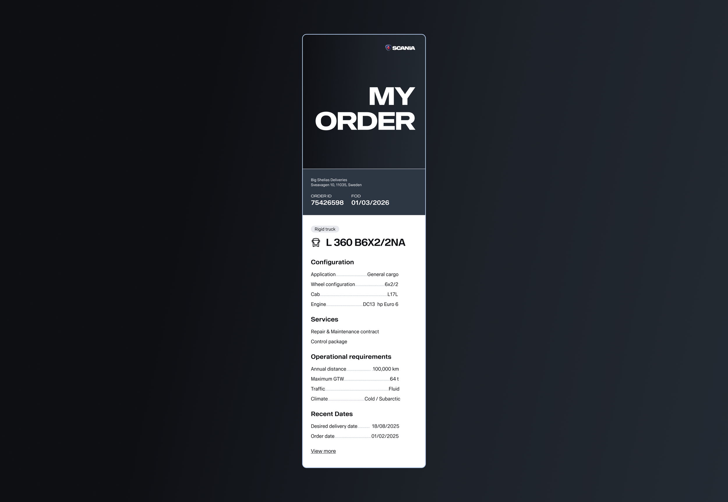
If the user requires more information on one of their vehicles then the link to view more (in the top right corner of each card) then takes them to the below page, order item page.
My Order - item page
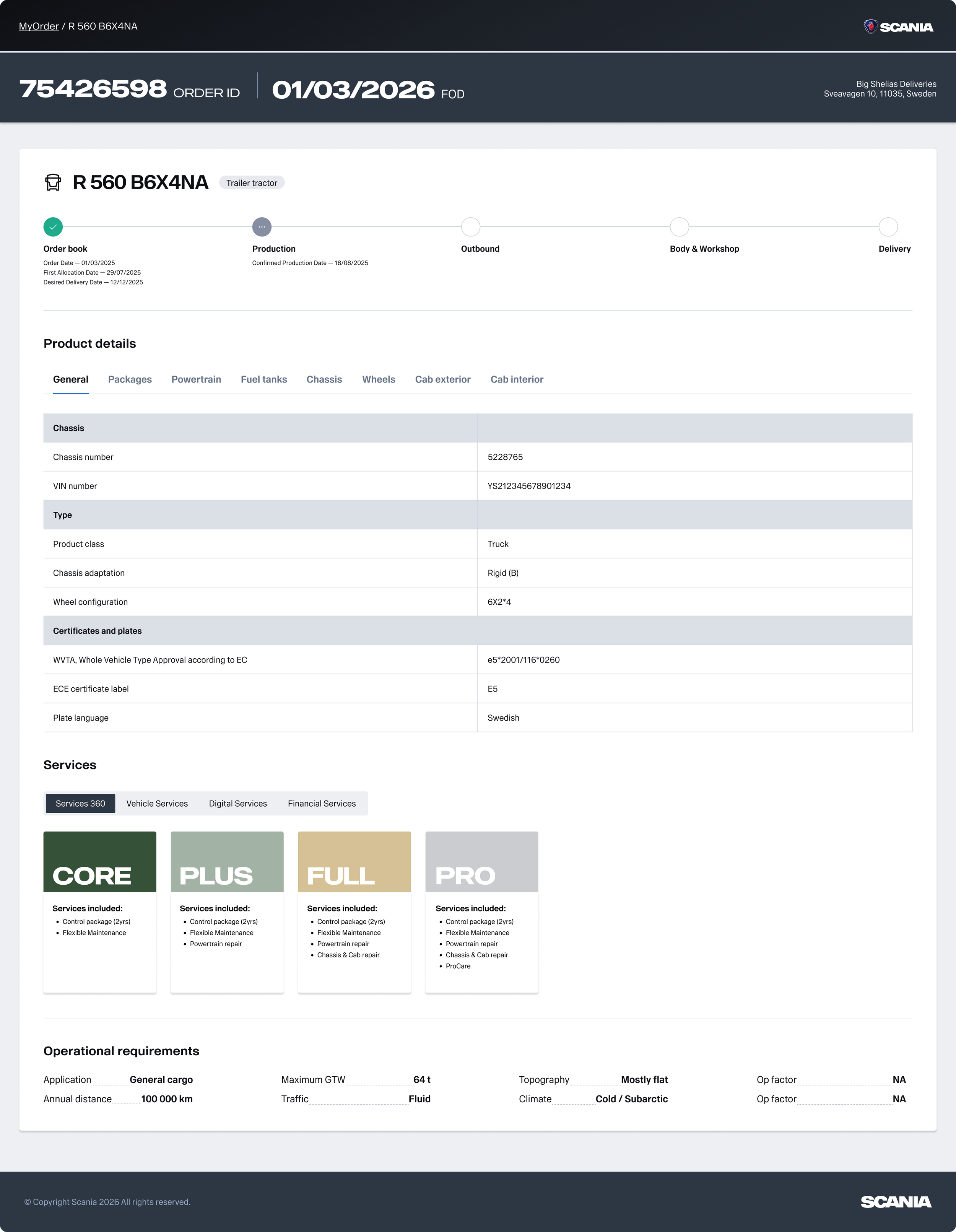
Here the order item (vehicle) is displayed in a detailed view. The same timeline component is used but with a deeper dive into the steps within each stage of the process. There is a breadcrumb navigation component used in the header of the page for the user to return to the order overview. The user can also find the full vehicle specification table which uses tabbed navigation for different specification areas.
My Order Analytics
And the fun didn’t end there. Myself and the Product Owner, being a data driven pair, wanted to create a tool around this product which allowed us internally at Scania to measure how users were interacting with the MyOrder platform. The users for this internal analytics tool would be product owners and UX designers, but would be open to anyone who wanted to get some insight on how customers were tracking their orders.
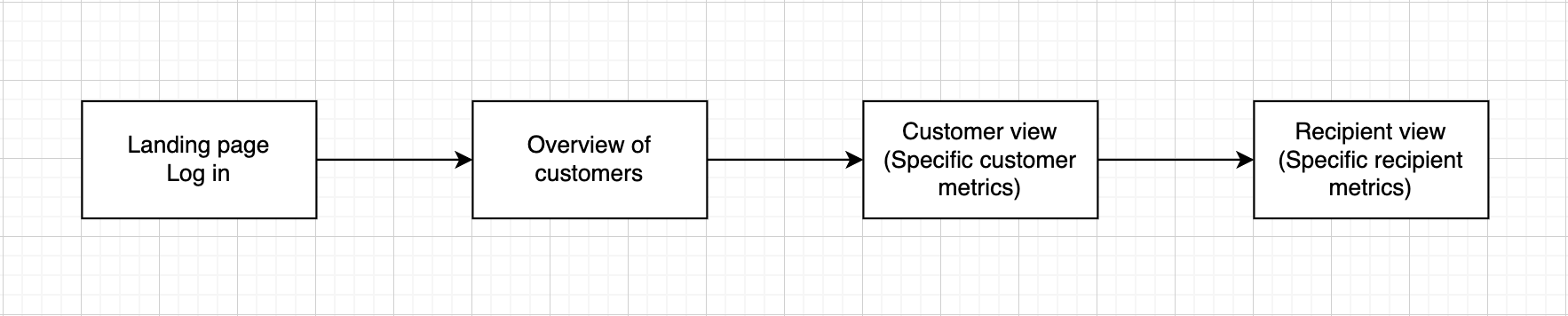
The journey went simply from login, to an overview showing all customers (in this case the term customer refers to a business), to then a detailed view of one specific customer, to then a specific recipient (user of the MyOrder platform).
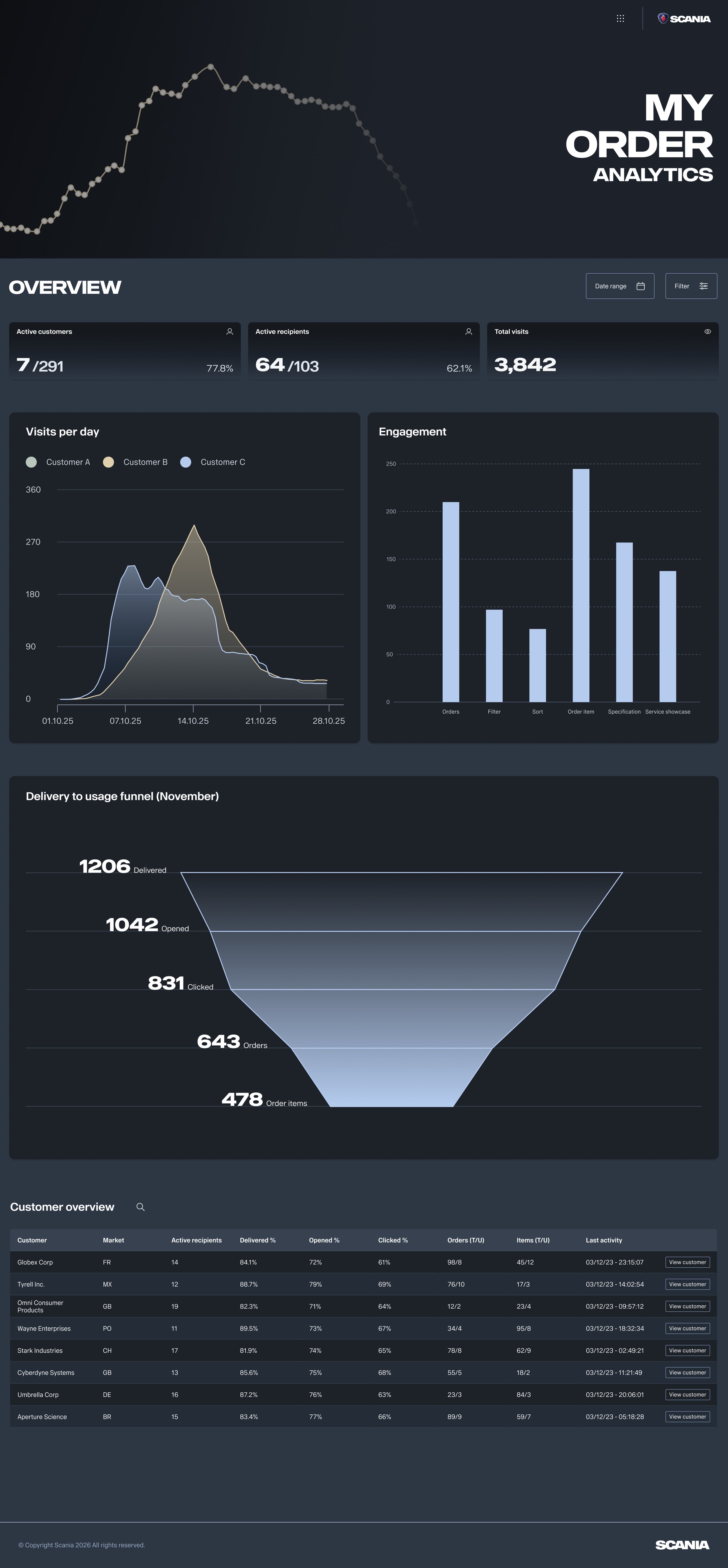
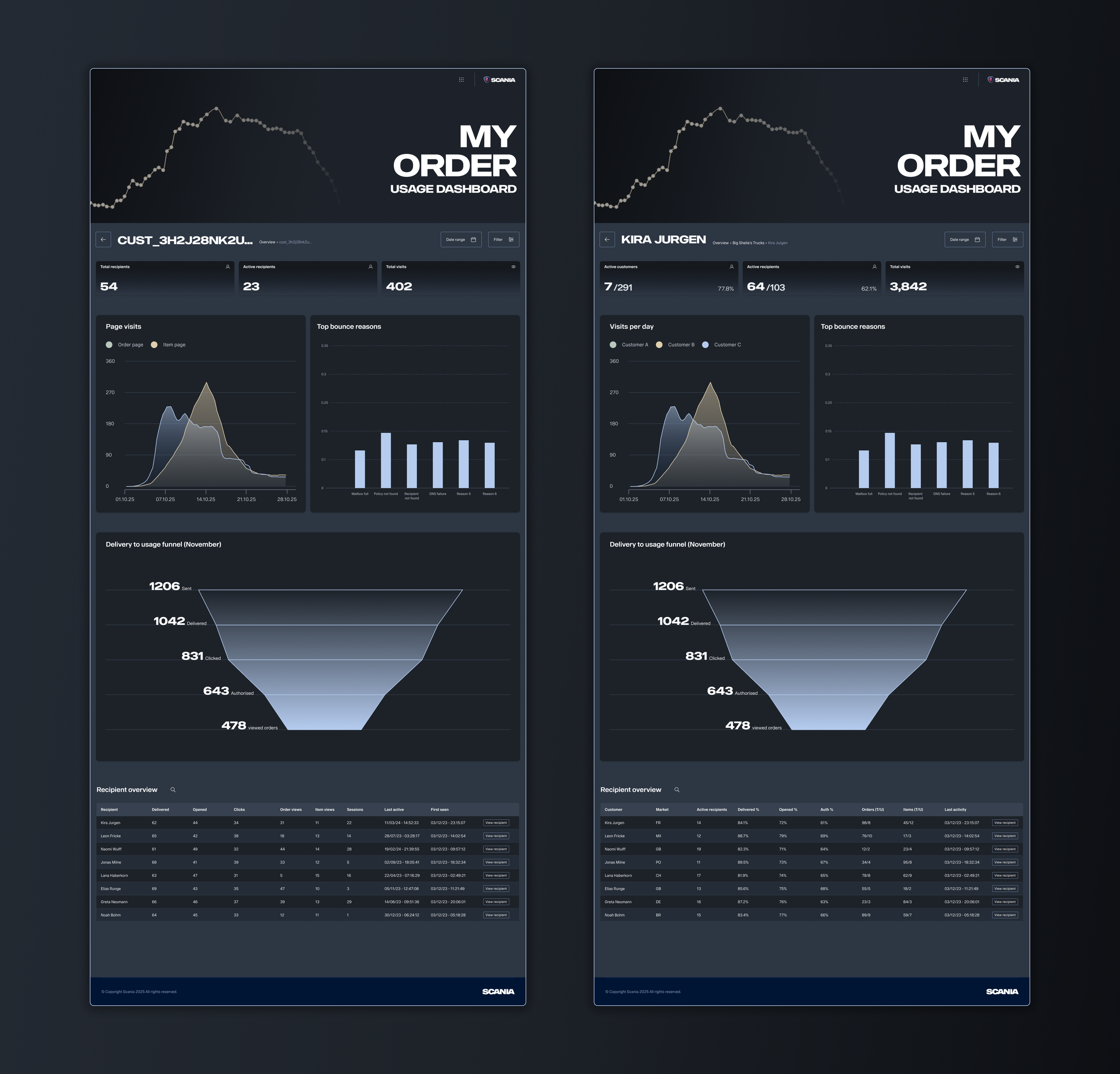
After deciding which metrics would be relevant for each page, I got to work on using the Tegel data visualisation library, which has some beautiful foundational elements and components. Following the design language of the MyOrder platform itself, I wanted to dive into the dark mode theme for the page to really make the metrics jump out (or dare i say it, “pop”).
To give the analytics tool some personality of its own I added a data vis element into the hero section, and implemented the dark gradient into some of the metric card components. The bar and line charts were taken from the Tegel design system library, but I had the opportunity to create the conversion funnel UI for tracking how many users were going the distance with the tool.
MyOrder Analytics landing page
MyOrder analytics overview
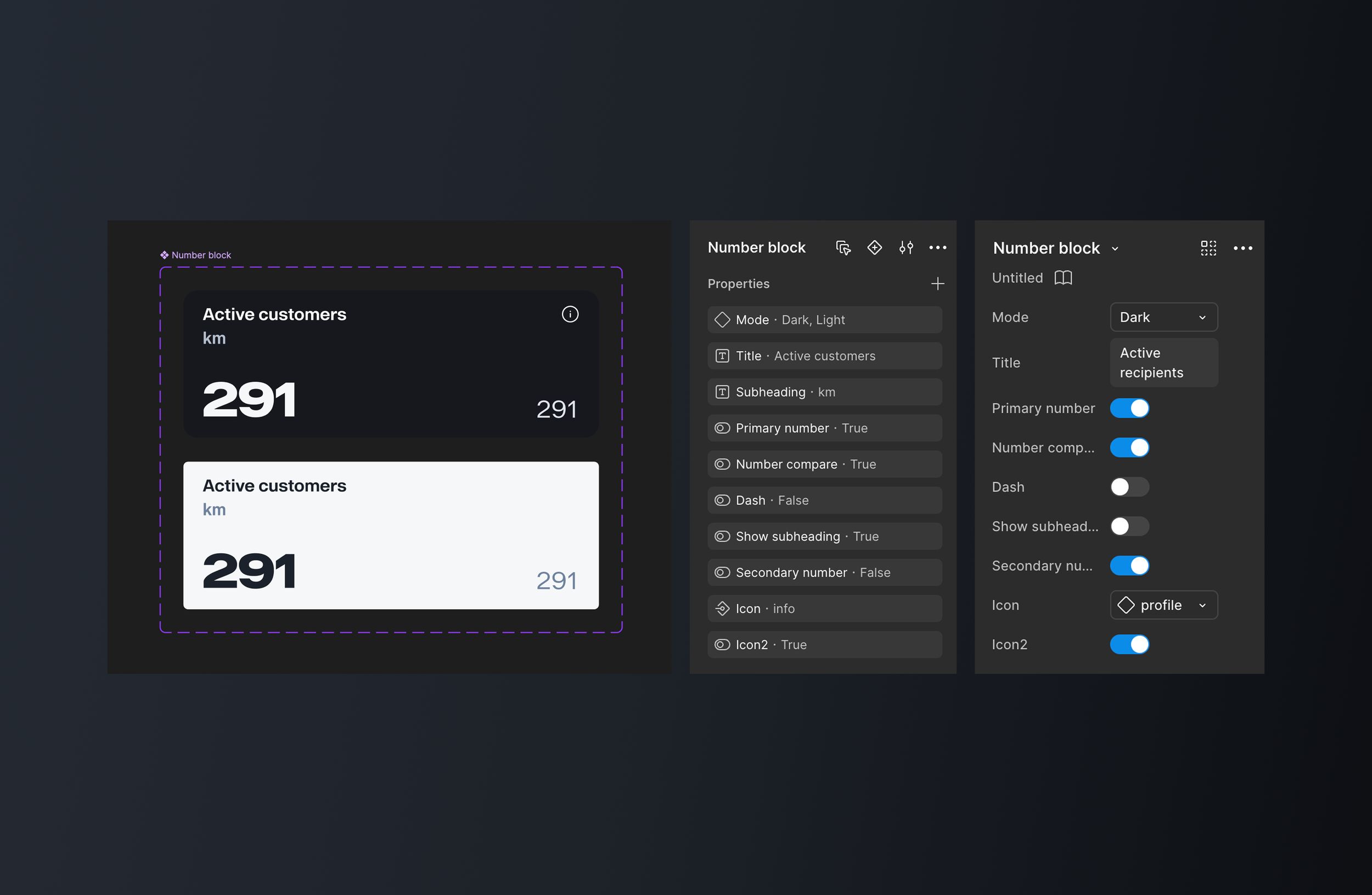
For the number card (or number block) I created, I used Tegel elements to build a custom component, and included various boolean/variant properties into the master component so it could cover as many different metric requirements as required, for displaying lots of data that may be useful for the user. Below you can see the master component on the left, in the middle there is the properties panel to show what’s included, and on the right there’s a properties panel shown from a component instance.
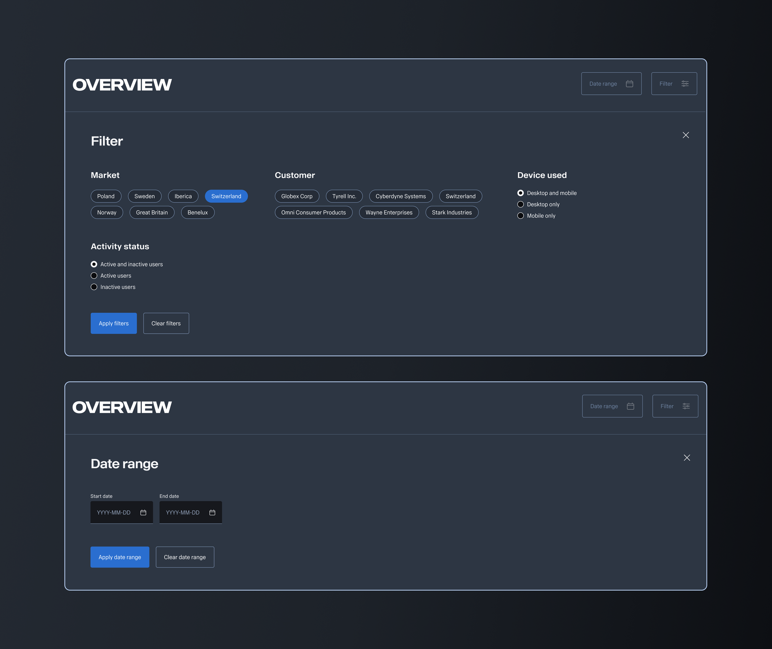
The filter functionality and date range allows the user to deep dive into specific insight using chip components for selecting multiple customers and markets, as well as radio button inputs controls for activity status and devices used to access the MyOrder platform.
The customer and recipient overviews follow the same layout and components (metric cards, charts, funnel, and table, but provide different metrics.
Outcomes & Impact
Reduced dealer support calls in pilot markets (Sweden and Great Britain).
Increased customer trust scores in surveys: “I feel more in control of my order.”
Improved alignment across departments on communication standards.
Strengthened Scania’s brand perception as transparent and premium.
The tests and iterations with pilot markets showed the product was popular because it fitted into the company’s wider strategy of omnichannel - a concurrent parallel experience for the user during their sales process which exists both online and offline, through the digital channels but also through the sales representative. This product fits into that strategy, as we saw through feedback from markets saying “customers felt much more empowered and self-sufficient with their orders”. They no longer have to rely on calling or emailing their sales rep or dealer to find out what’s happening with their order.