H&M Design System - Component Creation
Password creation form field
A frequent task within the Design system (DS) team at H&M is to create new components. This involves research, UX, UI, documentation and engineering. Typically my role requires me to take ownership of all of these stages of the component creation process. Below is an overview of the research and design of a variant of the form field component; the password creation field.
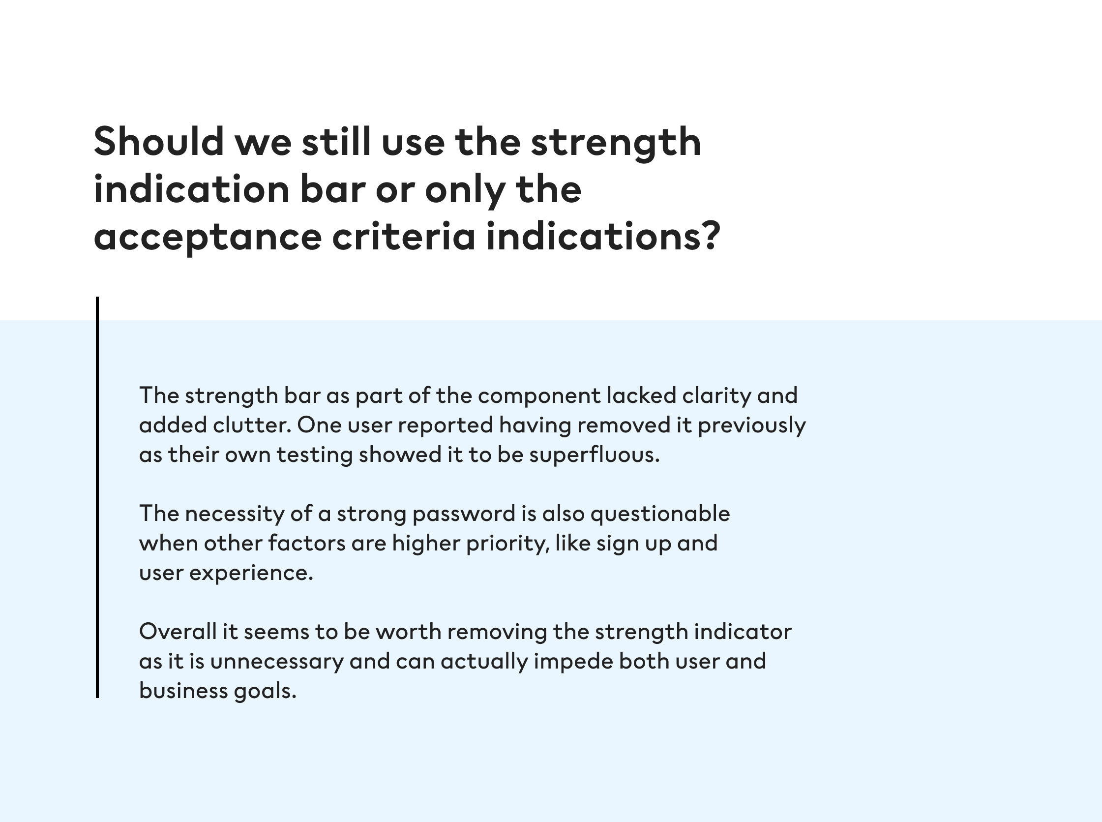
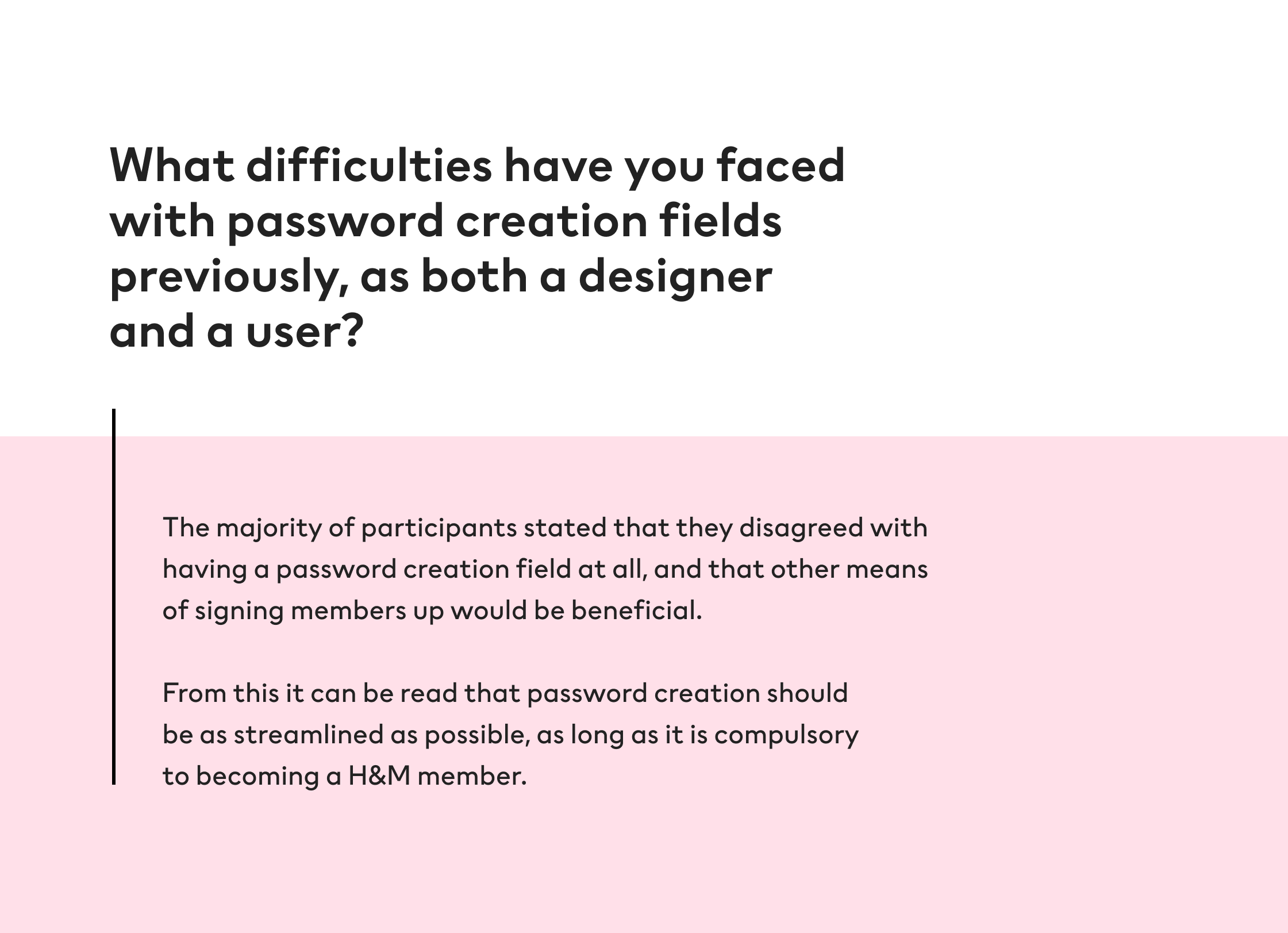
The password creation field is challenging in its nature as it must deal with numerous states and variants depending on user input, all the while providing a straightforward experience. This component is key to numerous teams within H&M as signing up for membership is an important part of customer engagement and success metrics. Numerous ‘debris’ components existed in our production environments, unconnected to the DS, giving inconsistent experiences, some better than others.
Alignment
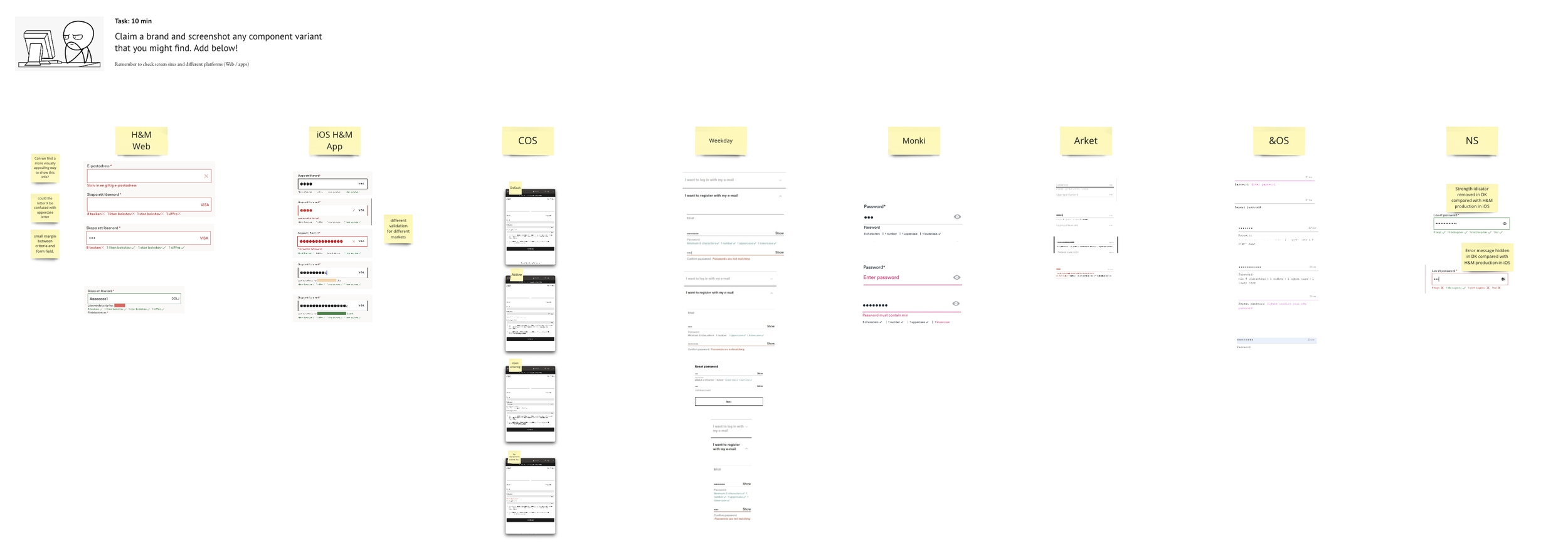
A kick off workshop involving all the DS team designers and engineers is the first step. This way everyone knows what the requirements are for the component, and what those involved with building it should be aware of. When facilitating these sessions I ask the team to explore and document what the H&M Group brands currently have in production; what can we learn from these examples? Are they working? How can they be improved?
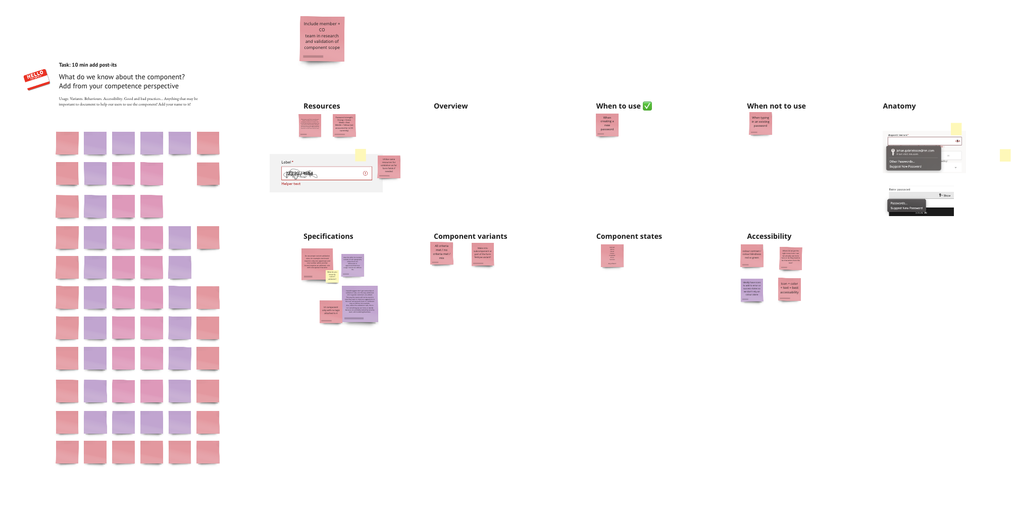
With this analysis in mind, I then ask the team to write down on thoughts surrounding different areas of the component, when and when not to use, anatomy, accessibility, states, variants and so on.
User research
Often the alignment stage gives more questions than it does answers! Which is why it’s then important to consult designers within the community who will implement this component into their products. These users will often have useful insights into the component from a product perspective, as well as extensive experience into how it works in production.
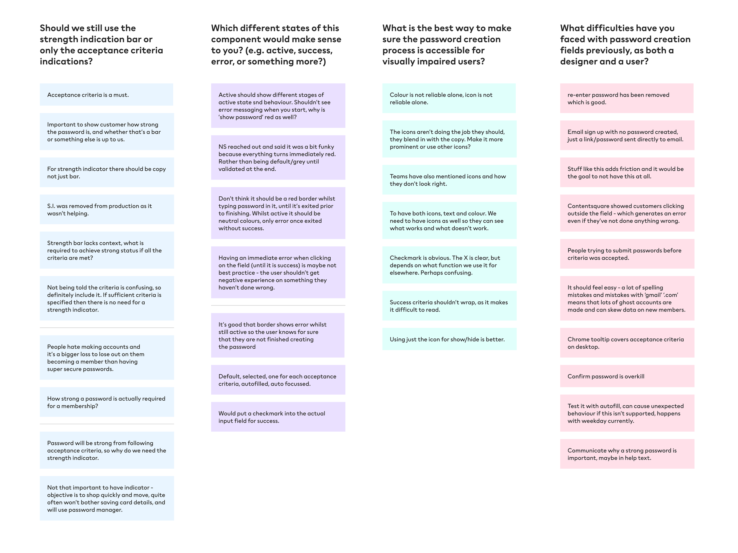
After conducting user interviews with designers who use this component (and have conducted their own usability tests with previous versions of it), I put together an affinity diagram of their insights. I use this as a means of grouping key themes and extracting shared insight.
Insights
Design
With the above questions being firmly answered, I then moved onto the component build in Figma. Some of the following you can see below:
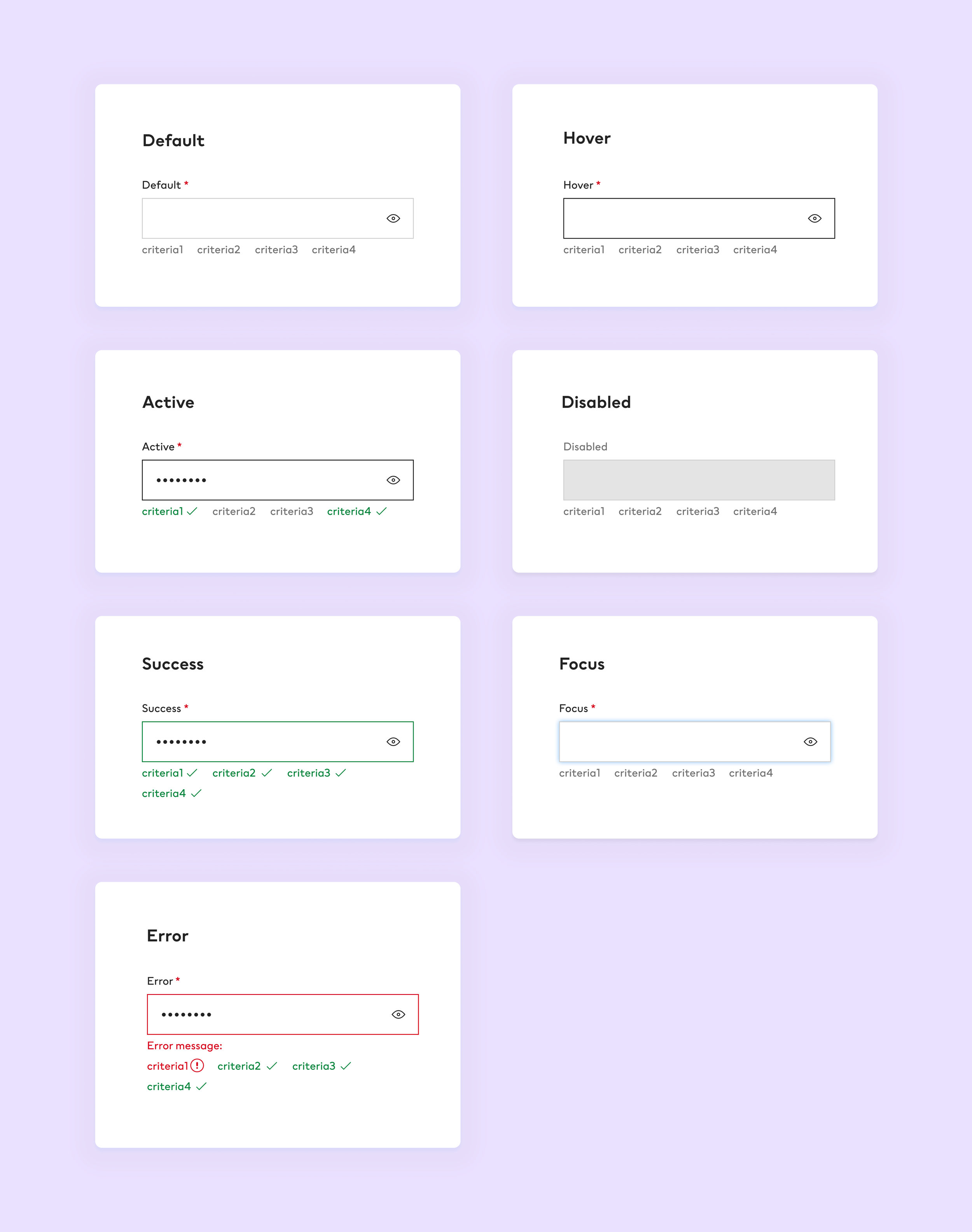
Increased spacing (8px) between acceptance criteria to make it more legible for users, especially when icons are included.
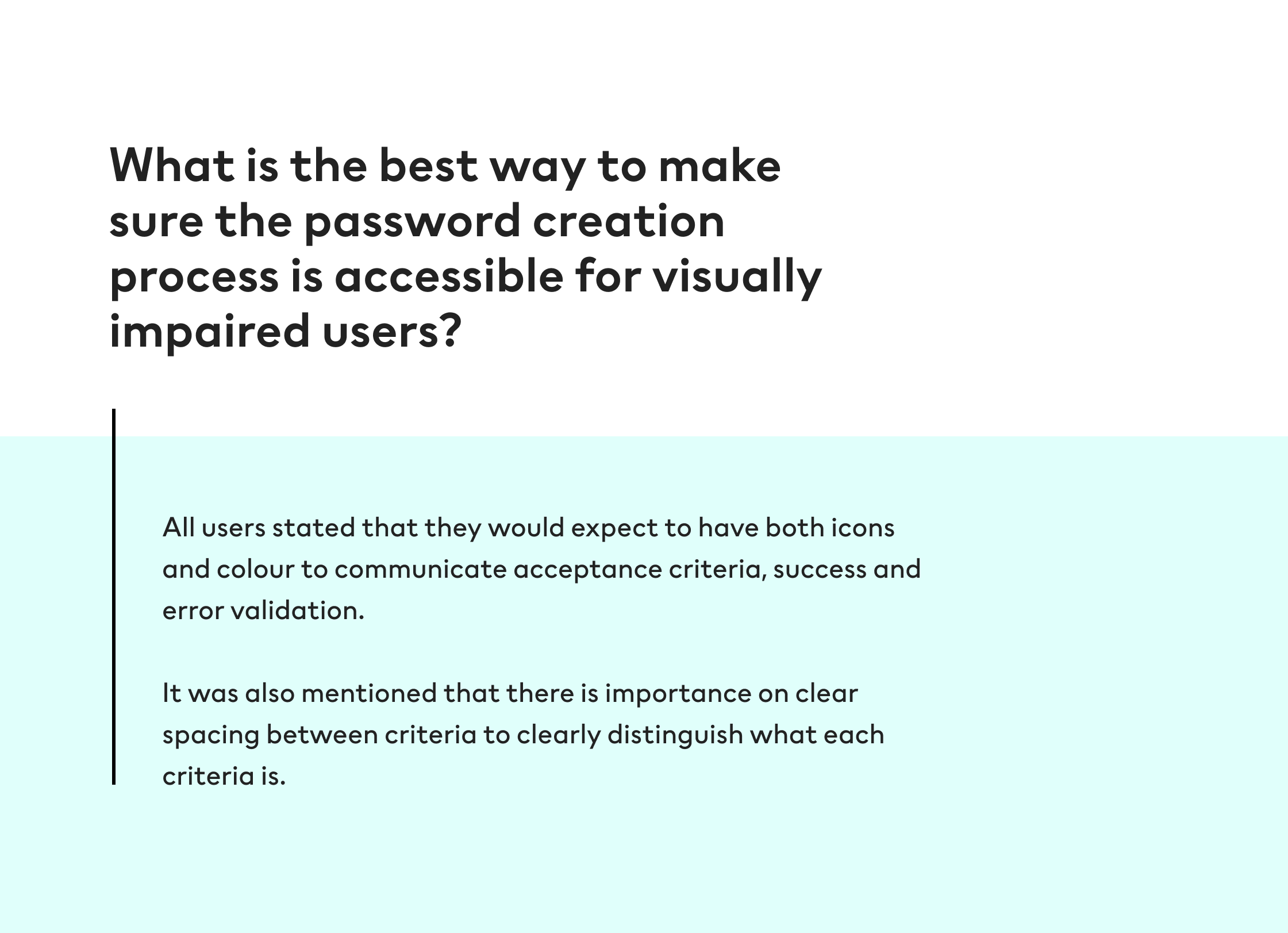
Use of icons and colour for acceptance criteria success and error states. Accessibility can’t rely on only one of these so it’s best to use both
Use of the correct icon for error state. In H&M Design System the error icon is an exclamation mark in a circle, the cross which may be assumed as the correct icon is used for ‘clear’ functionality.
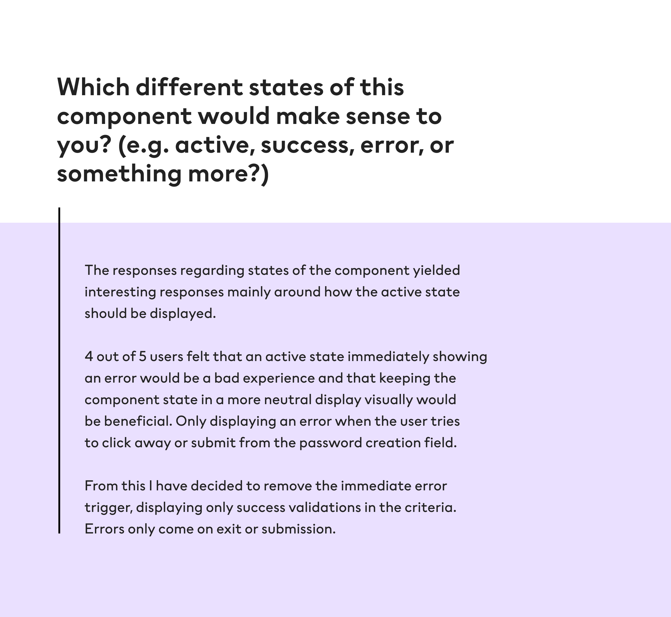
Active state not showing error validation whilst the user is still in the process of entering information - telling the user they have made an error before they have clicked away or tried to submit an insufficient password is a poor experience.
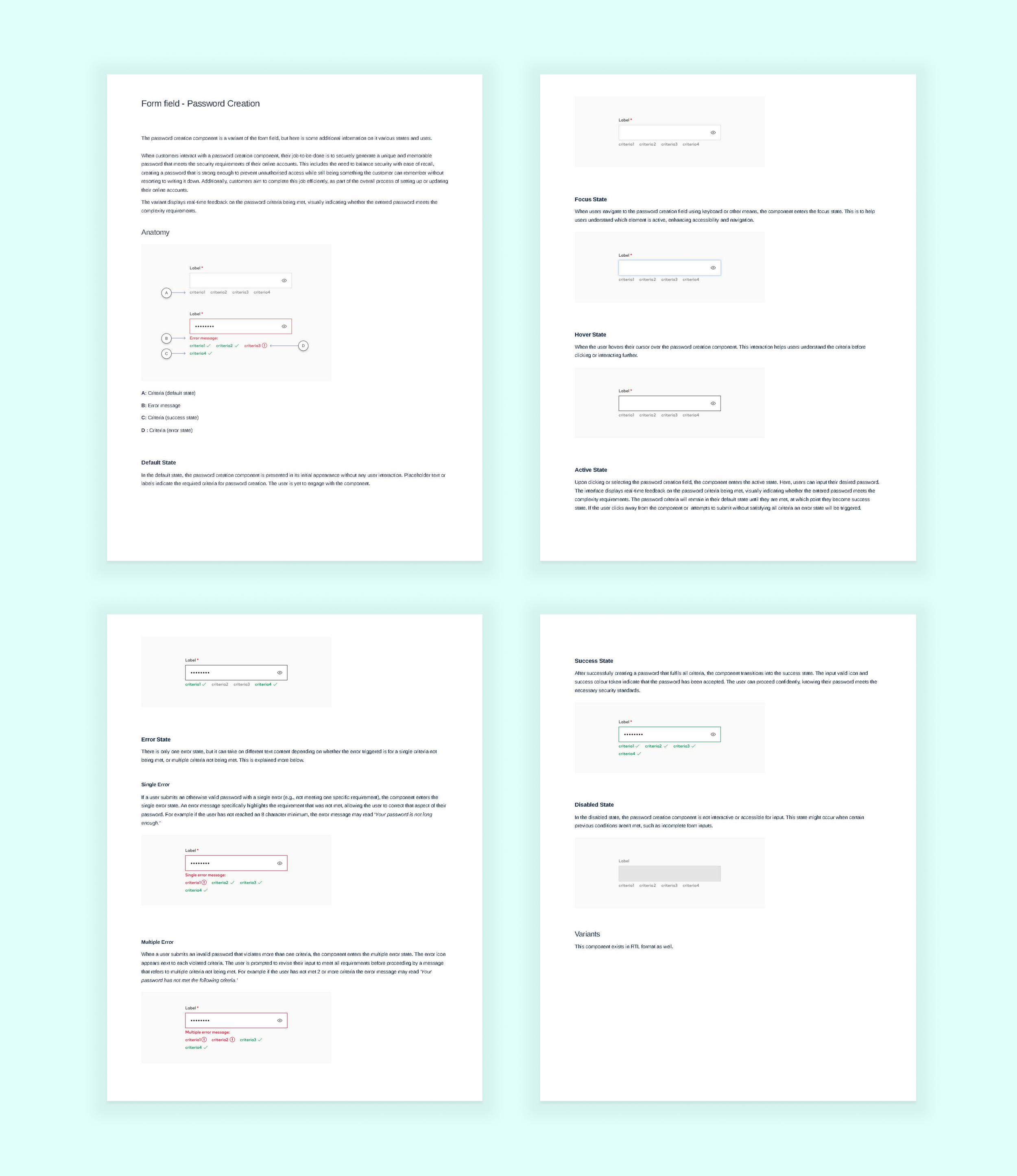
Documentation
Next came the documentation for the component. As this component is a variant of the form field (which is already a component in the H&M Design System and already has its own documentation), the documentation for password creation was for additional information. Mainly regarding how the different states worked. The following was also communicated with the engineering arm of the DS team for a consistent experience working from the same tokens and specifications.